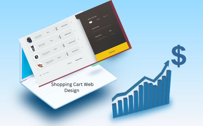
When it comes to e-commerce, every click, scroll, and interaction counts. Your website’s design isn’t just about aesthetics—it’s about guiding users through a seamless purchasing journey. An optimized Shopping Cart Web Design can make all the difference between a potential customer finalizing their purchase or abandoning the cart. In fact, nearly 70% of online shoppers abandon their carts before completing a purchase, according to the Baymard Institute.
But why do so many customers leave without buying? The answer often lies in how the shopping cart is designed. A poorly designed shopping cart can frustrate users, leading to lost sales. So, how can you design your shopping cart to increase conversion rates? Let’s explore some key elements that can turn casual browsers into loyal customers.
1. Simplify the Checkout Process
- Less is More
One of the most effective ways to increase conversion rates is to simplify the checkout process. Many users abandon their shopping carts because the checkout is too complicated or time-consuming. To prevent this, minimize the number of steps required to complete a purchase. Ideally, aim for a one-page checkout process where customers can fill in all necessary details without navigating through multiple pages.
- Guest Checkout Options
Forcing customers to create an account before purchasing can be a major turn-off. Offering a guest checkout option can help retain those who are just looking to make a quick purchase without committing to an account.
2. Optimize for Mobile Devices
According to Statista, mobile commerce is expected to account for nearly 44% of total e-commerce sales in the United States by 2025. If your shopping cart isn’t optimized for mobile users, you could be missing out on nearly half of your potential sales.
- Responsive Design
Ensure that your shopping cart is mobile-friendly with a responsive design. This means your site should automatically adjust to fit any screen size, making the checkout process smooth and easy on both smartphones and tablets.
- Touch-Friendly Buttons and Fields
Make sure all buttons, links, and form fields are easy to tap on a mobile device. Avoid small fonts and closely spaced elements that can cause misclicks and frustration.
3. Minimize Distractions
When a customer is on the checkout page, your goal should be to eliminate anything that could distract them from completing their purchase. This means removing unnecessary navigation menus, sidebars, and promotional pop-ups.
- Clean Design
A clean and minimalistic design can guide customers toward the purchase button without any distractions. Use white space effectively and keep the focus on the product and the checkout process.
- Remove Non-Essential Links
Consider removing links that take customers away from the checkout process, such as the homepage link or category navigation. If customers need to go back, they can use the browser’s back button.
4. Build Trust with Security Features
A significant reason for cart abandonment is a lack of trust in the security of a website. Displaying security badges and payment verification logos can reassure customers that their information is safe.
- SSL Certificates
Always ensure that your checkout page is secured with an SSL certificate, which encrypts sensitive information such as credit card details. The padlock symbol in the address bar and “https” before your URL are indicators that your site is secure.
- Trust Seals
Displaying trust seals from well-known security providers like Norton, McAfee, or TRUSTe can give customers peace of mind. These seals show that your website has been vetted and meets industry security standards.
5. Offer Multiple Payment Options
The more payment options you offer, the easier it is for customers to complete their purchase. Limiting payment methods can cause customers to abandon their cart if they can’t find their preferred way to pay.
- Credit/Debit Cards and Digital Wallets
Offer major credit and debit card options along with popular digital wallets like PayPal, Apple Pay, and Google Pay. These options not only cater to a wider audience but also provide quicker checkout options.
- Buy Now, Pay Later (BNPL)
Services like Afterpay and Klarna are gaining popularity as they allow customers to split their payments over time. Offering BNPL options can make higher-priced items more accessible and increase conversion rates.
6. Provide Clear Call-to-Actions (CTAs)
Your call-to-action buttons (e.g., “Add to Cart” or “Proceed to Checkout”) should stand out and be clearly visible. Use contrasting colors and persuasive text to guide users through the checkout process.
- Effective CTAs
Phrases like “Complete My Purchase” or “Secure Checkout” can encourage users to take the next step. Avoid generic phrases like “Next” or “Continue” as they don’t convey a sense of urgency or purpose.
7. Incorporate Real-Time Support
Having support readily available can resolve any issues a customer faces during the checkout process, preventing cart abandonment.
- Live Chat and Chatbots
Implementing a live chat or chatbot on your checkout page can help customers get answers to their questions in real-time. This reduces frustration and builds confidence in completing the purchase.
- FAQs and Help Sections
Include links to FAQs and help sections that address common checkout-related questions, such as shipping policies or return procedures.
Conclusion
An effective Shopping Cart Web Design isn’t just about aesthetics it’s about creating a user-friendly, efficient, and trustworthy experience that guides customers toward completing their purchase. By simplifying the checkout process, optimizing for mobile, minimizing distractions, and building trust, you can significantly increase your conversion rates. Small design tweaks can lead to big results, turning potential customers into loyal buyers. Thank visiting magazinesus.com


